
Walk into any home and the first thing you notice is not the furniture, the curtains or the artwork. It is the colour on the walls. Colour sets the mood before anything else does. It can make a compact living room feel calm and airy, or it can make even a spacious hall feel heavy and closed in. If you have been searching for living room color ideas that actually work in real homes, not just in magazine photos, you are in the right place.
Most of us live in apartments or houses where the living room does many jobs. It is a place to relax, host guests, watch television, work from the sofa and sometimes even eat. Because it does so much, the wall colour has to be flexible, comfortable and easy to live with for years. In this detailed guide, we will look at seven colour ideas that make rooms look bigger, explain why they work, show how to pair them with furniture and lighting, and help you avoid the most common painting mistakes.
Why Colour Changes the Way a Room Feels
Before we jump into the shades, it helps to understand the simple science behind space and colour. Light colours reflect more light. Dark colours absorb it. A room that reflects more light appears wider, taller and more open. That is why designers often reach for soft whites, pale neutrals and gentle pastels when a room is small.
But size is not only about brightness. Colour temperature matters too. Cool colours such as pale blue and soft grey tend to recede visually, so walls look further away. Warm colours such as deep red or mustard tend to advance, making walls feel closer. This does not mean you should never use warm or dark colours. It means you should use them with intention and in the right proportion.
Lighting also changes everything. The same paint can look creamy in the morning, greyish at noon and yellow under warm bulbs at night. A room facing north receives cooler, softer light, while a room facing south or west receives warmer, stronger light. Keep this in mind while reading the ideas below.
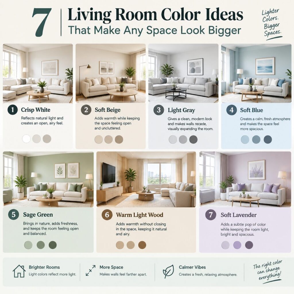
1. Soft Warm White
If you want the safest option, choose a warm white. Pure bright white can sometimes look cold, flat or even clinical, especially under white LED tube lights. A warm white with a slight cream or ivory undertone feels welcoming while still reflecting plenty of light.
Warm white works with almost every kind of furniture: dark wood, cane, upholstered sofas, metal frames and colourful cushions. It also gives you freedom to change your decor later. You can switch curtains, rugs and artwork without repainting.
How to use it well:
- Paint the ceiling in the same warm white or one shade lighter to create a seamless, taller look.
- Add texture through jute rugs, linen curtains and woven baskets so the room does not feel plain.
- Use wooden or brass accents to add warmth.
- Choose a matte or eggshell finish to avoid glare and to hide small wall imperfections.
Best for: small living rooms, rented homes, people who like to change decor often.
2. Light Greige
Greige is a blend of grey and beige, and it has become one of the most loved modern wall colours for a good reason. It feels calm, sophisticated and neutral without being boring. Light greige reflects a good amount of light and does not show every small mark, which is helpful for families with children.
The trick with greige is to choose the right undertone. Some greiges lean pink, some lean green and some lean yellow. Test a sample on your wall and view it near your sofa and flooring. If your floor tiles have a strong cream tone, choose a greige with a warm undertone. If your floors are cool grey, pick a slightly cooler greige.
How to use it well:
- Pair it with wooden furniture in medium tones for a balanced look.
- Add contrast with charcoal cushions, black metal frames or a dark coffee table.
- Bring in one colour accent, such as mustard, terracotta or teal, through cushions and artwork.
Best for: modern apartments, homes with mixed furniture styles, people who want a timeless look.
3. Pale Sage Green
Green has a natural, refreshing effect, and pale sage is a soft, greyed-out version that feels relaxing rather than loud. Sage green brings a hint of nature indoors, which many people find calming. It also works beautifully with indoor plants, cane furniture and natural fabrics.
To keep the room looking spacious, choose a light sage with grey or white mixed in. Avoid deep forest green on all four walls in a small room, as it can make the space feel enclosed. You can, however, use a darker green on a single accent wall or on a bookshelf back panel.
How to use it well:
- Combine sage walls with cream sofas, light oak furniture and white curtains.
- Add brass or gold-toned lamps to give a warm glow.
- Use plants with different leaf shapes to create a layered, fresh feeling.
Best for: rooms with good natural light, people who love a calm and earthy style.
4. Powder Blue
Light blue has long been used to make small rooms feel larger. It resembles the sky, and our eyes naturally read it as open and distant. Powder blue is gentle and soothing, and it pairs nicely with white trim, wooden floors and metallic accents.
However, blue can feel cold in rooms that do not receive much sunlight. If your living room is dim, choose a blue with a slightly warmer, greyish base, and use warm bulbs to balance the mood. In sunny rooms, a crisp powder blue can look fresh and cheerful all day.
How to use it well:
- Match with white or cream sofas and natural wood tables.
- Add pops of yellow or peach cushions for a cheerful contrast.
- Use sheer white curtains to let light flow through.
Best for: sunny rooms, coastal or breezy styles, people who prefer a cool, peaceful atmosphere.
5. Blush Beige
If you want warmth but not a bold colour, blush beige is a lovely middle ground. It is a soft neutral with a whisper of pink, which gives walls a gentle glow, especially in evening light. It flatters skin tones, makes guests feel comfortable and looks elegant with gold, brass and rose-toned accessories.
The key is to keep the pink very subtle. Too much pink can feel sweet or juvenile, while a well-chosen blush beige feels sophisticated and welcoming.
How to use it well:
- Pair with off-white sofas, walnut wood and soft green plants.
- Use velvet cushions in muted teal, olive or deep maroon for depth.
- Add warm white bulbs around 2700K to 3000K for a cosy evening ambience.
Best for: people who want a cosy, welcoming living room with a slightly feminine, soft touch.
6. Monochrome Layering
A monochrome scheme uses different shades of the same colour throughout the room. For example, you might use a very light grey on the walls, a medium grey sofa and charcoal cushions. Or you could layer cream, sand and camel tones together. Because the eye does not jump between contrasting colours, the room feels smooth, connected and visually larger.
Monochrome does not mean boring. The secret is texture. Combine matte and glossy surfaces, rough and smooth fabrics, and different patterns in the same colour family. This creates depth without breaking the calm.
How to use it well:
- Choose three shades of one colour: light for walls, medium for large furniture and dark for small accents.
- Mix textures such as bouclé, linen, wool, wood and metal.
- Add one small contrasting element, such as a single artwork or a green plant, to keep it lively.
Best for: minimalist lovers, modern homes, people who want a clean and organised look.
7. Light Ceiling and Slightly Deeper Walls
This idea is more of a technique than a single colour. Painting your ceiling a lighter shade than your walls draws the eye upward and makes the ceiling feel higher. In a room with a low ceiling, this can make a noticeable difference.
For example, if your walls are soft greige, paint the ceiling in warm white. If your walls are pale sage, use a lighter, whiter green-tinted ceiling. Avoid dark ceilings unless your room is very tall and you want a cosy, dramatic look.
How to use it well:
- Keep the ceiling matte to reduce glare and hide imperfections.
- Use vertical elements such as tall curtains hung close to the ceiling to add height.
- Choose slim, light-coloured lighting fixtures rather than heavy chandeliers in low rooms.
Best for: rooms with low ceilings, apartments, older homes.
How to Test Paint Colours the Right Way
Choosing paint from a small chip at the store is risky. Colour looks different on a large wall. Follow these steps to reduce mistakes:
- Buy sample pots. Most paint brands sell small sample sizes for a small cost.
- Paint large patches. Cover at least a one-foot square area on two different walls.
- Observe at different times. Check the colour in morning light, afternoon and night with your normal bulbs on.
- Look next to your furniture. Compare it with your sofa, curtains and floor.
- Wait a day or two. Colours look different once they are fully dry.
This small effort can save you from repainting an entire room.
Choose the Right Paint Finish
Finish affects how big and clean a room looks:
- Matte: Hides wall imperfections and gives a soft, modern look. Slightly harder to clean.
- Eggshell or satin: Has a light sheen, reflects a little more light and is easier to wipe. Good for living rooms with children.
- Gloss or semi-gloss: Best for trim, doors and window frames rather than large walls.
For most living rooms, matte or eggshell is the best balance between beauty and practicality.
Lighting: The Secret Partner of Wall Colour
Even the perfect wall colour can look dull under poor lighting. Use layered lighting to bring your colour choice to life:
- Ambient light: ceiling lights or cove lighting for general brightness.
- Task light: floor lamps or reading lamps near seating.
- Accent light: wall lights or small lamps to highlight artwork or plants.
Choose bulbs with a warm white temperature, around 2700K to 3500K, for a cosy living room. Very cool white bulbs can make even warm paint colours appear greyish and flat.
Using Mirrors and Furniture to Improve the Effect
Wall colour is only one part of making a room look bigger. Combine it with smart furniture choices:
- Place a large mirror opposite a window to bounce natural light around the room.
- Choose furniture with visible legs, so you can see the floor beneath, which makes the room feel lighter.
- Avoid pushing all furniture against the walls; a little breathing space looks more designed.
- Keep the centre of the room clear for easy movement.
- Choose one large rug instead of several small ones, because it visually connects the space.
Common Living Room Colour Mistakes to Avoid
Even with the right shade, a few habits can spoil the result:
- Painting all four walls in a dark colour in a small room. If you love dark shades, limit them to one wall or to details like a bookshelf.
- Ignoring undertones. A white with a blue undertone next to a cream floor can look mismatched.
- Mixing too many bold colours. Stick to two or three main colours to keep the space harmonious.
- Skipping the ceiling. A stark white ceiling against warm walls can look harsh. Consider a softer white.
- Forgetting the trim. Doors and skirting boards in a clean shade create sharp, tidy edges.
- Following trends blindly. Choose colours you will enjoy for years, not only for a season.
Budget-Friendly Ways to Refresh Without Repainting
If painting the whole room is not possible, you can still change the feeling with smaller updates:
- Swap heavy dark curtains for light linen or sheer fabrics.
- Add a light-coloured rug to brighten the floor.
- Use cushion covers in fresh shades to echo your preferred palette.
- Paint only one accent wall.
- Remove clutter, since a tidy room always looks larger.
- Hang artwork in lighter frames.
Colour Combinations That Always Look Good
If you are unsure how to combine colours, try these dependable pairings:
- Warm white + wood + green plants: natural and timeless.
- Greige + charcoal + mustard: modern and warm.
- Sage + cream + brass: calm and elegant.
- Powder blue + white + tan leather: fresh and classic.
- Blush beige + olive + gold: soft and stylish.
Frequently Asked Questions
Which colour is best for a small living room?
Warm white, light greige, pale sage green and powder blue are excellent choices because they reflect light and make the room feel open.
Do dark colours always make a room look smaller?
Not always. A dark accent wall can add depth and drama, but painting every wall dark in a small room usually makes it feel tighter unless you have strong lighting.
Should the ceiling be white?
A white or very light ceiling is usually best because it lifts the room visually. You can use a softer warm white if pure white feels too harsh.
How often should I repaint my living room?
Most homes need a fresh coat every three to five years, depending on humidity, sunlight and how much daily use the room gets.
Can I mix warm and cool colours?
Yes, if you keep one dominant undertone and use the other in small accents. For example, a warm greige wall with a touch of blue in cushions can look lovely.
What is the best paint finish for a family home?
Eggshell or satin is a good option because it resists stains better and is easier to wipe than fully matte finishes.
Final Thoughts
You do not need a large budget or an interior designer to create a bright, spacious-looking living room. Start with a light, well-chosen wall colour, test it properly, support it with good lighting and add texture through fabrics and plants. Whether you choose a warm white, a calm sage green or a soft blush beige, the best colour is the one that makes you feel relaxed the moment you walk in.
Pick one of these seven living room color ideas, order a couple of sample pots this week and see how your walls transform. A room that feels larger, lighter and more welcoming is often just one thoughtful paint choice away.